A.N.D. Studio is an independent design and branding studio based in Huddersfield, West Yorkshire. We are here to bring clarity, value and distinction to brands with design and ideas.

A.N.D. Studio is an independent design and branding studio based in Huddersfield, West Yorkshire. We are here to bring clarity, value and distinction to brands with design and ideas.


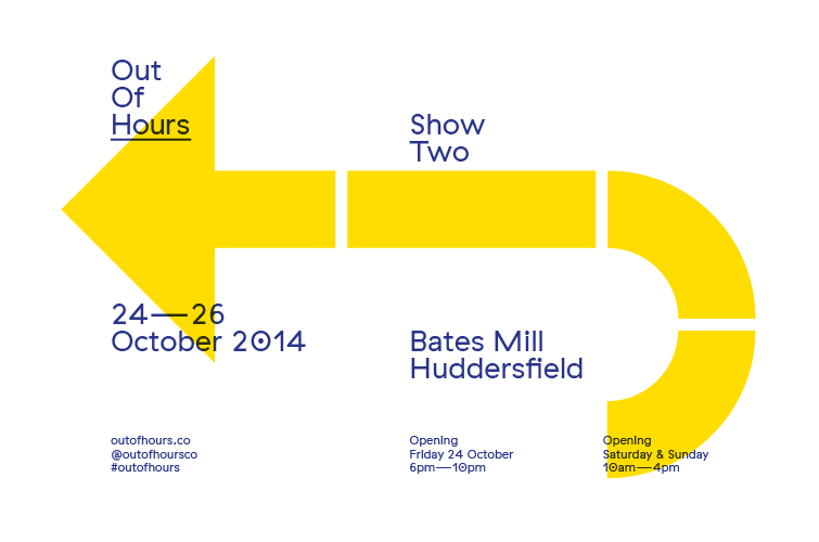
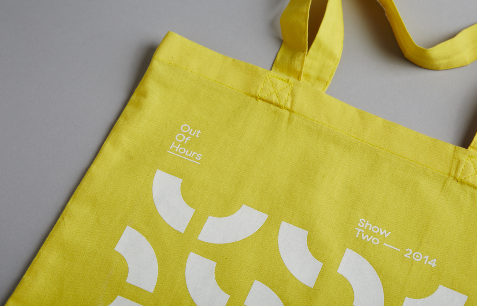
The second show from the Out Of Hours collective took place in another industrial space, this time the theme of the show focused on place.
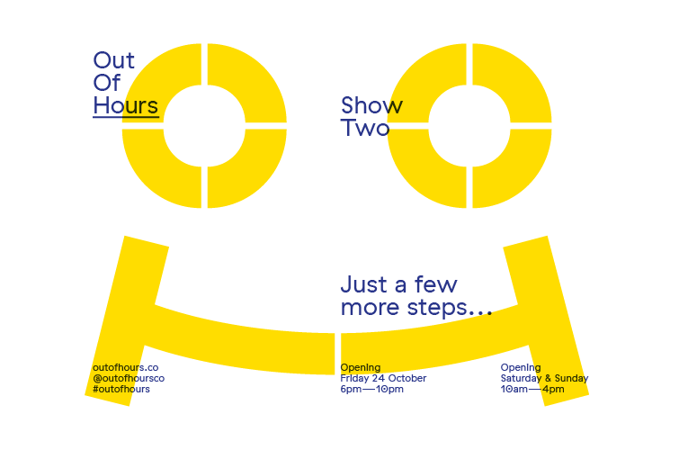
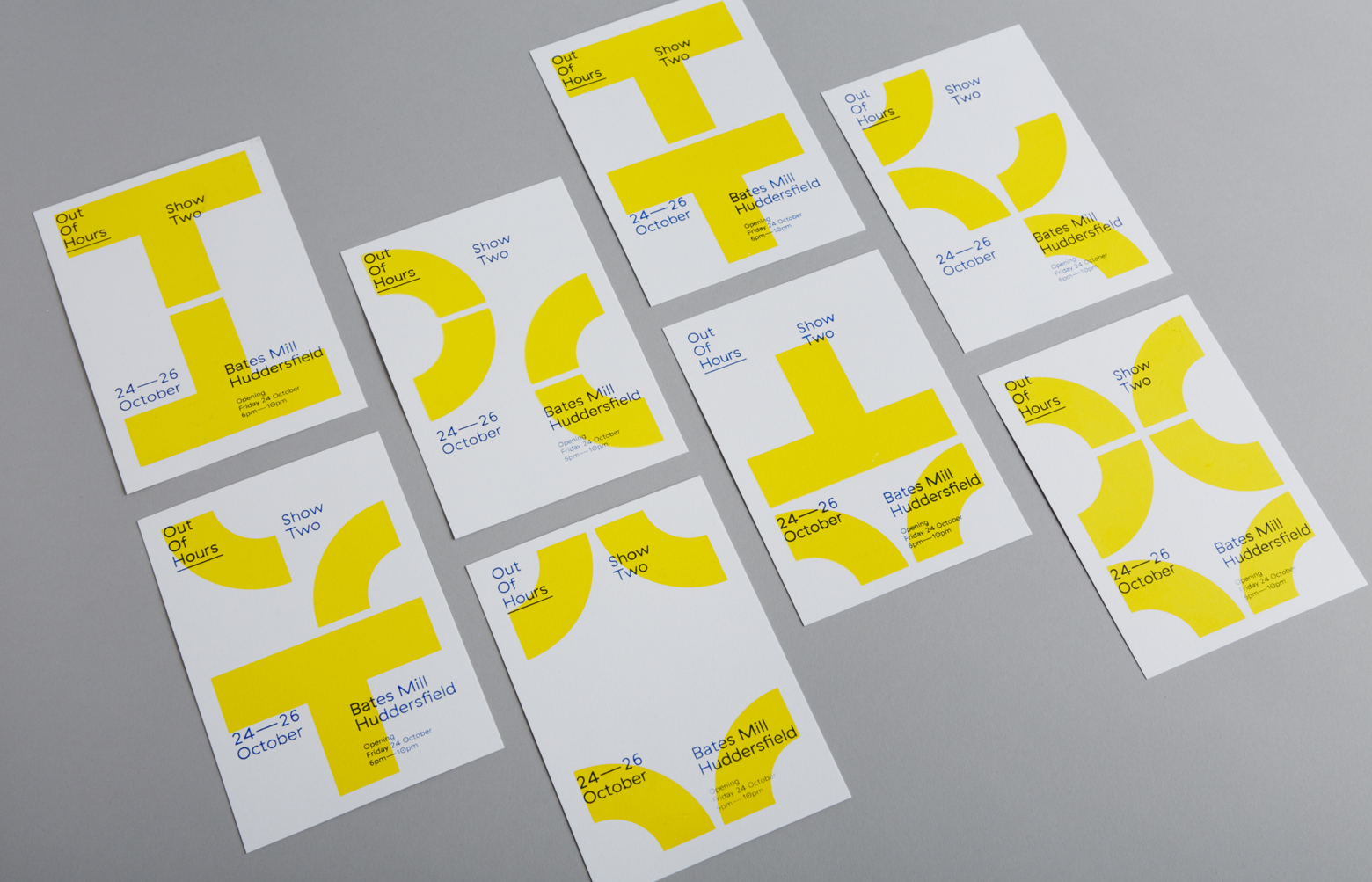
We decided to create a new visual identity to reflect the new body of work to be exhibited. As the show was based in Huddersfield, the colours were chosen from the Yorkshire flag. The OOH logo was also broken up into basic shapes to represent the pattern of dialect, its inherent rhythmic character and the strong connection to place and people’s surrounding environment.
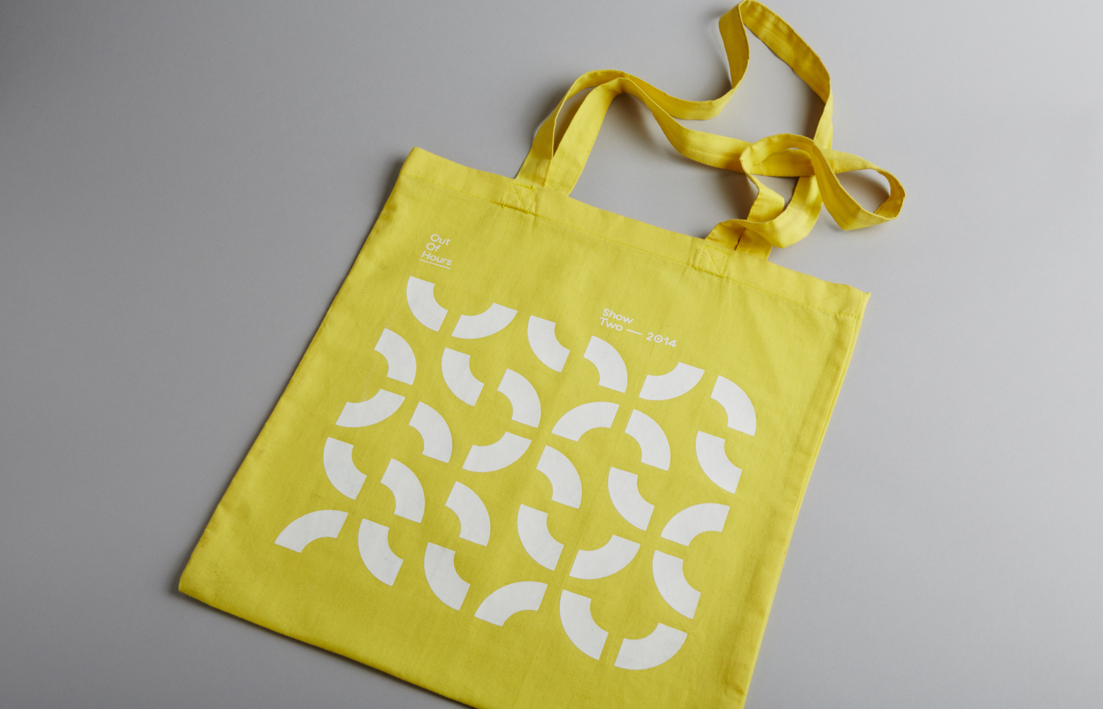
The brand identity design elements extended into screen-printed invites and posters, signage and website. It also helped inspire our first typeface, Ernest. Check out the project here.